When I previously wrote about the many different movie posters that appeared in Superman II, it certainly looked like I had titled that blog “The Posters of Superman II”, the play on words being the word of instead of in.
Since then, I asked myself the most obvious question: “Why not?” So I decided to go for broke and look at five of the most distinctive posters that promoted the spectacular sequel. Why five, you ask? Because they represent the most important elements of the film that defined the multilayered story of the Man of Steel’s romance with Lois Lane and the ultimate fight between good and evil against the villains from the Phantom Zone.
And it all began with this poster announcement:
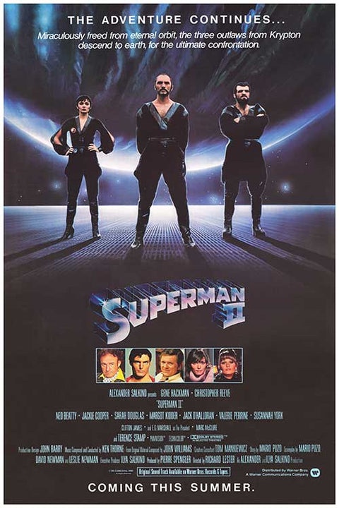
This first one caught my eye with that tagline and the prominent display of the villains front and center in the piece. The fact that it has an otherworldly backdrop to it adds an extra element of suspense to what promised to be an action packed film. What’s also interesting is that a picture of our main star, Christopher Reeve, is relegated to the bottom of the poster along with his co-stars. Whoever designed this particular poster wanted to make sure that, while it is clearly a Superman film, Reeve did not overshadow the main threat at hand here, the villains. To me it is the most stylistic of the posters.
In addition, the poster’s predominant tagline—The Adventure Continues—would be used throughout the development process for later poster variants to come, and it would also be used as the unofficial subtitle for the sequel’s release in the United Kingdom and a number of foreign territories.
Next we come to this design, which appeared in posters for the UK and German theatrical releases, among others:
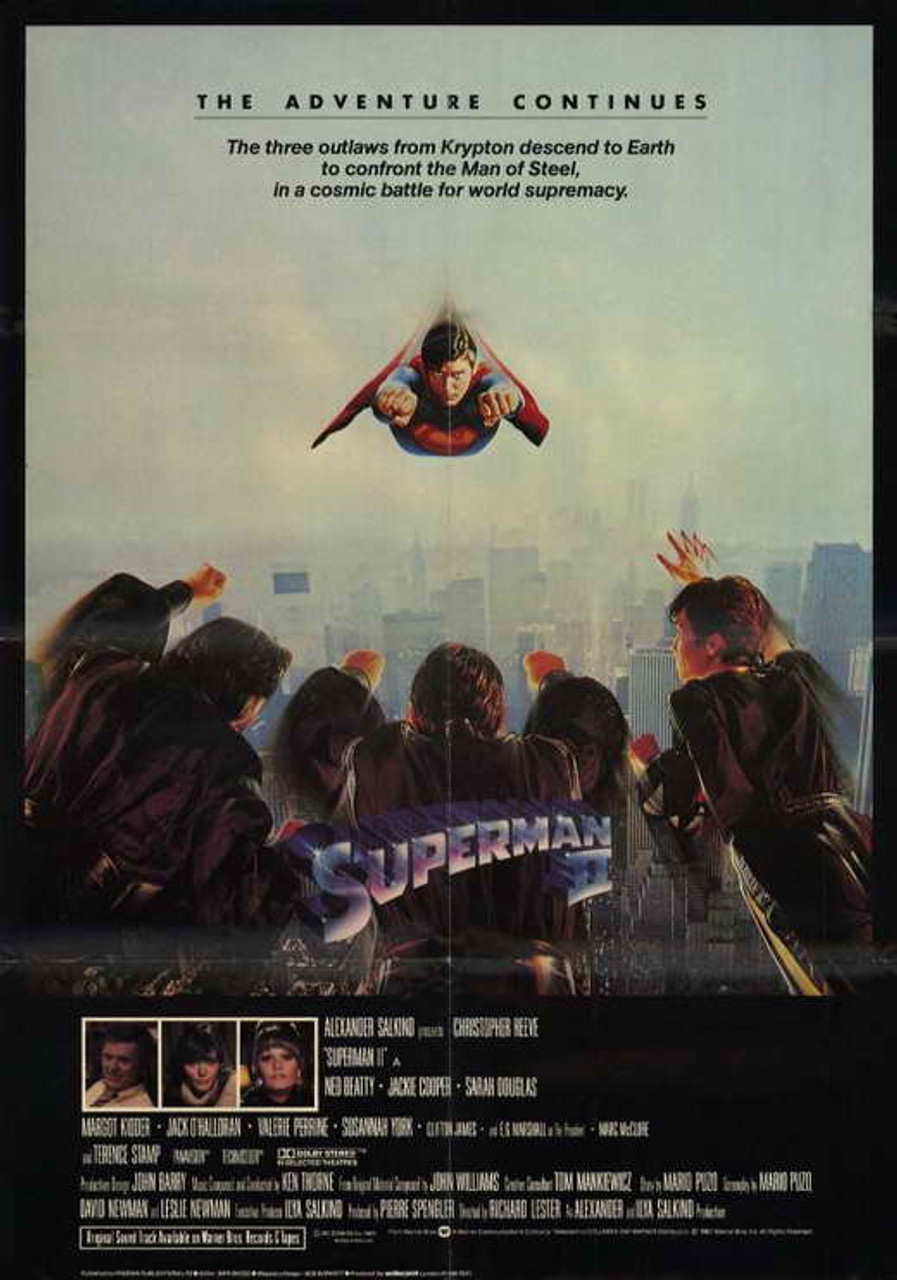
I first came across this design in, of all places, the Topps trading card set from the summer of 1981, and for years it was the only place where I had seen this particular design. It is here that we get our first glimpse of Superman confronting the villains over the skies of Metropolis. In the poster design, the streaks are evident on all four of the Kryptonians, but the skyline is a bit hazy. We can hardly make out the cityscape in the middle of the poster. In addition, the poster’s statement about the villains battling Superman for cosmic supremacy has now been finalized and will carry through later poster developments.
However, there is something that has been glaringly left out. It took a little while for me to notice the omission, and then it stuck out like a sore thumb.
For some reason, at this point Gene Hackman’s name and picture is not present on the poster. Only Christopher Reeve’s name is included above the cast and production credits. It’s possible and quite likely that someone accidentally left off Hackman’s name from the poster credits.
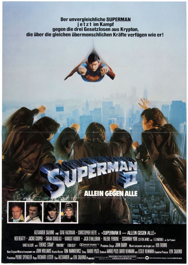
Whatever the reason is for the omission, Hackman’s name and picture was added to the poster, as evidenced by this German language poster.
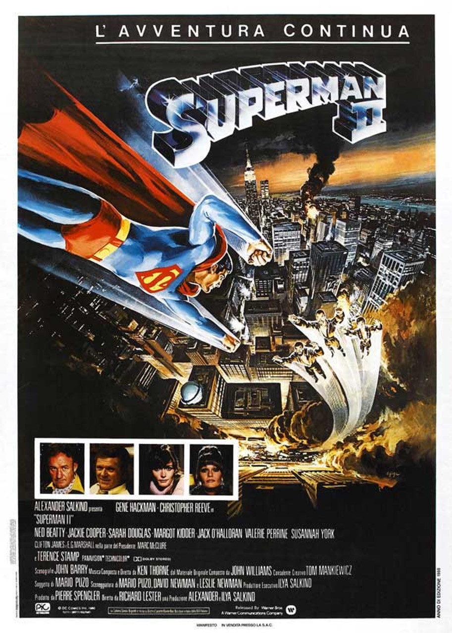
But the poster’s predominant elements of Superman and the three villains in flight were later lifted and used in the final theatrical poster for the film’s release in North America, Japan, and other territories.
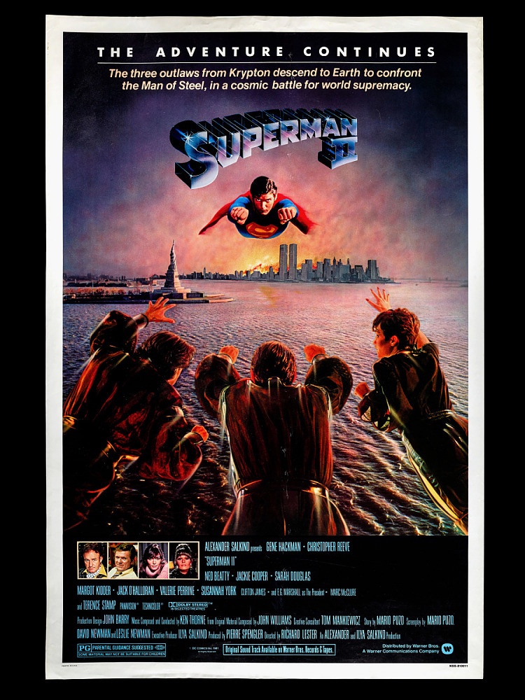
Here, the elements are superimposed over a new painting of Metropolis (aka New York City) on fire, and the majority of the flying streaks from the previous concept poster have been removed for this print. And this was years before the advent of Photoshop!
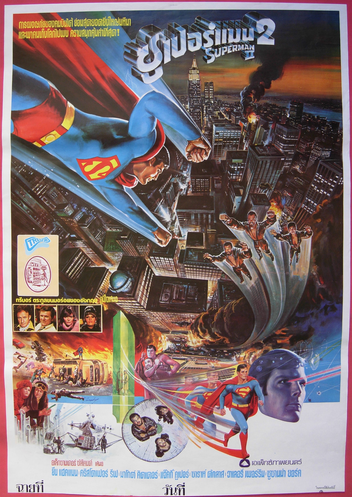
Next, we come to this interesting variant that appeared in a number of foreign markets including France, Italy, Israel, Thailand, Japan, Belgium, and other countries.
This particular variant showcases Superman and the villains in flight over Metropolis, which is drawn in an angle that emphasizes movement in flight.
In addition, the Thai poster variant includes many other moments from the film, as evidenced by this particular print.
Finally, we come to the advertising poster for Superman II: The Richard Donner Cut, released in 2006.
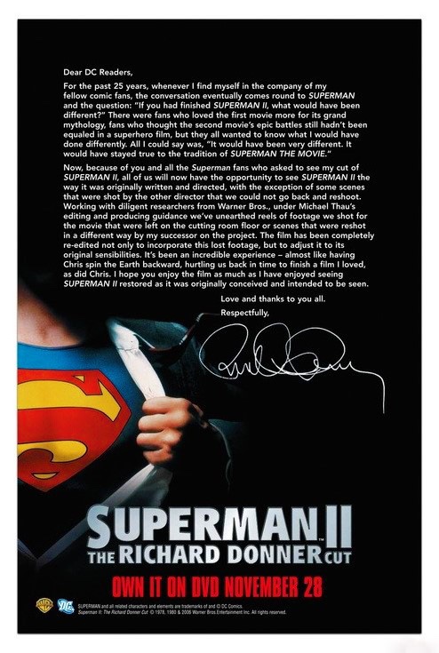
With this particular one, the crystalline logo which was used for the first three films has been replaced with a more straightforward block logo to display the film’s title. And here, only one promotional image is used to indicate that this is a Superman film. Ironically, in the Donner Cut we never see Clark Kent ripping his clothes off to transform into the Man of Steel.
The rest of the poster is devoted to a message from Richard Donner expressing his thanks to Michael Thau for discovering the lost footage and restoring the film to its original concept, while at the same time deliberately avoiding any mention of Richard Lester’s work on the sequel and referring to him as “the other director”. While not a true theatrical movie poster per se, it does promote the film’s world premiere on DVD in November 2006.
So which one is your favorite design?
One response to “The Movie Posters of “Superman II””
Number 4 is my favorite!!
LikeLike